Imagine you try to walk into a store but before you can, an employee jumps out and asks you to sign up for their newsletter. With an annoyed “No, thanks,” you try to pass by and go about your business. Why would you want to do that before you knew anything about the place, let alone whether you liked shopping there or the products they offered?
Seems obvious that this would be bad for business, right?
Yet we do this to people all the time on the Web. You follow a link and are immediately hit with a popup or overlay blocking you from your goal. You’re asked to give up some personal information, before you’ve established any kind of relationship, or before getting anything in return. It’s a crap deal.
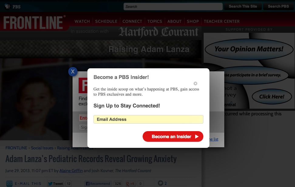
I recently clicked from Google News to a story on Frontline and was subjected to not just one newsletter signup overlay but two, one stacked on the other.
Who is the person pushing this kind of stupidity? What inane internal politics led to this? Maybe the double-popup is a (really bad) technical error, but regardless, soliciting signups this way is bass-ackward. You might actually boost signups by some amount with brute force, but at what cost?
In fact, the price you pay is in your brand value. Frontline is a highly regarded news program, and here they are cheaply hawking a PBS newsletter as well as their own. It feels junky. It feels like spam.
From a usability standpoint, the violations are egregious. You haven’t even glimpsed the content of interest and two modal dialogs are blocking your path. The “x” buttons are small and hard to click, and for many users it will just be easier to hit the back button than try to continue.
If you’re a non-profit organization, it seems especially important not to frustrate your users. After all, you’re relying on their charity for funding.
Remember: Interactions with technology are just stand-ins for interactions with humans. You want newsletter signups?
- Show your customers what you have to offer.
- Establish a relationship.
- Build trust.
- Provide a clear way to engage that doesn’t completely block their experience.
Fewer signups/surveys? Maybe, but the ones you get will be higher value. You’ll glean the more interested, intentional users for signups and survey feedback, while still providing a great experience for everyone. Most importantly, you maintain your brand.