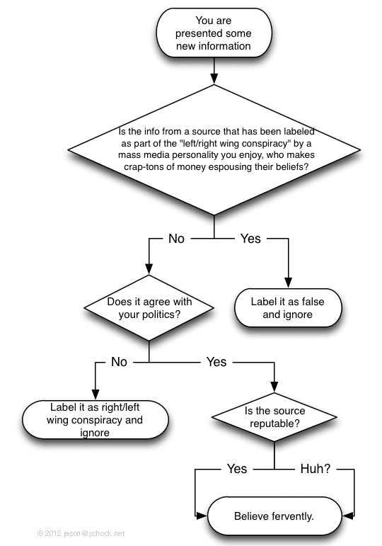
Thinking is hard, and living in the modern age means processing more information than ever. Then you throw politics into the mix … Ow, brain hurt! Luckily for you, I made a simple flow chart to help you quickly process new information.

Thinking is hard, and living in the modern age means processing more information than ever. Then you throw politics into the mix … Ow, brain hurt! Luckily for you, I made a simple flow chart to help you quickly process new information.

I love the sound of race cars. They loud, they’re sexy, they’re exciting. The American Le Mans Series is a mixture of different classes of cars, all blasting around the track at the same time in the same race. You’ve got production-based Corvettes, BMWs, Ferraris, Lotuses, Aston-Martins; and race-bred Le Mans prototypes like Lolas, Orecas, Oak-Morgans, and HPDs. These cars run all types of different motors, from turbocharged four-cylinders to monster V8s, and they all have a signature engine note.
Take a listen to some of these awesome sounds from the ALMS Long Beach race this weekend at the 2012 Long Beach Grand Prix (watch in HD for best quality).

My 2008 unibody Macbook Pro has a loose screen. Loose and wobbly and drunken at times. It’s been chugging along loyally for over three years, and in Internet time, it’s like a Regis Philbin. But as we all know, old folks can get wobbly. No shame in that — but it happens.
The whole screen/monitor (the part that flips up) developed about 2 cm of back-and-forth play, and it felt like perhaps the hinge was loose. Still usable, but definitely putting a dent in my Macbook’s sexy. Google didn’t proffer any good solutions, so I decided to dive into the unknown and try exploratory surgery on my Mac.
It turns out the fix is pretty straightforward. You just need the right tools and about an hour.
I’ve been interested in information design for a long time, have read most of Edward Tufte’s books and recently started playing with data visualization. The idea of taking a heap of data that is otherwise meaningless in its raw form, making sense of it in some visually meaningful way, and especially making it beautiful, is really cool.
(more…)
I added a handy Google Slide Show widget to my site, which pulls images from an RSS feed from my photo site. Radical like Zinka, but there was no photo randomization. With a little 1337 h4x0ring I was able to do it. You, too, can get the chicks. (more…)
I have an unnatural affinity for “Liking” stuff on Facebook — especially my own stuff (why? because I can).
With Facebook’s new Open Graph initiative, they’ve made it easy for me to stick Like buttons all over my personal Web site, too. When you click one, a little man will carry your display of approval through some tubes to the Facebook, whereupon a trained monkey transcriptionist will bang away at a typewriter until something makes sense, finally sneaking into my house late at night to glue your message to the inside of my monitor.
Amazing stuff. Get your Like on.
Information design expert Edward Tufte has long railed against PowerPoint and its mind-numbing cognitive style, and the chartjunk – bright, happy graphics with little informational content – that almost always accompany a presentation.
(more…)
In case you’re looking for the latest & greatest Velocity TextMate bundle, Thomas Aylott was nice enough to quickly update the old one (hosted on the Macromates svn repository) for me after I emailed him with a bug.
It’s available here: http://github.com/subtleGradient/Java-Velocity.tmbundle
I recently used Prostores for an e-commerce site for a client. “An eBay company”, it says. They have to be pretty legit, right? Umm, not necessarily.
